
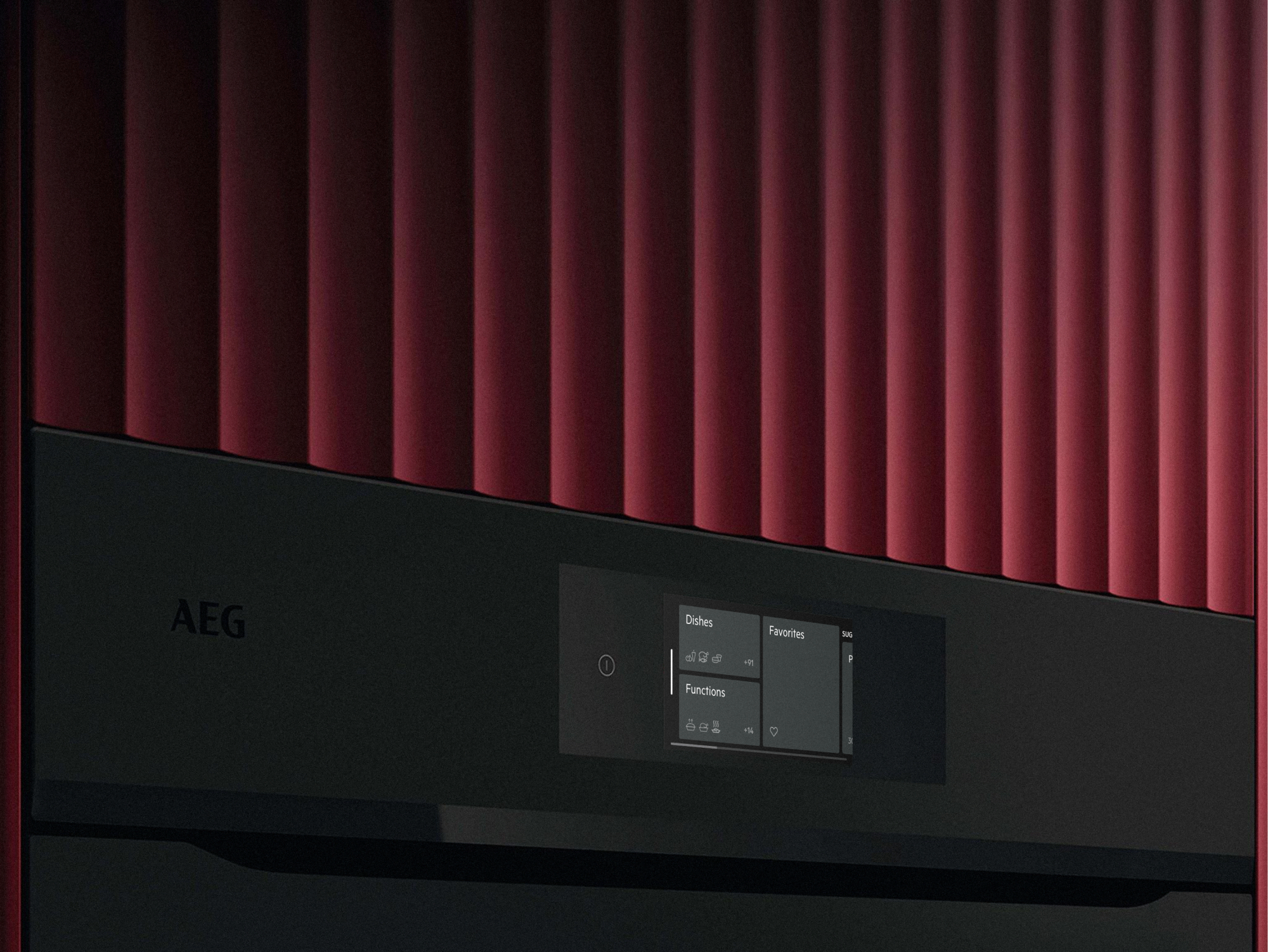
Next-generation smart cooking interface for connected kitchen appliances


Context
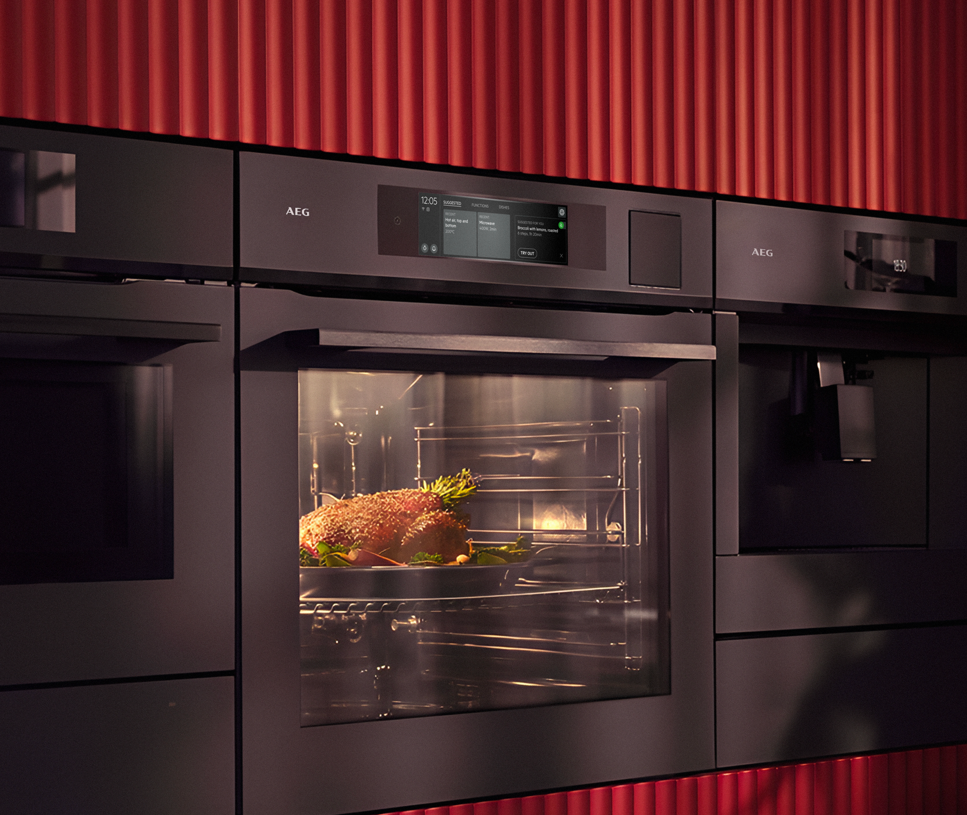
Electrolux and AEG were building their next generation of built-in ovens. I joined a team of five designers working on the touchscreen interface, alongside parallel teams designing coffee machines and hobs. I was brought in for the visual UI: make the final product look right and stay consistent with the rest of the family. Over time the role grew to cover information architecture, team organisation, tools and workflows as well.

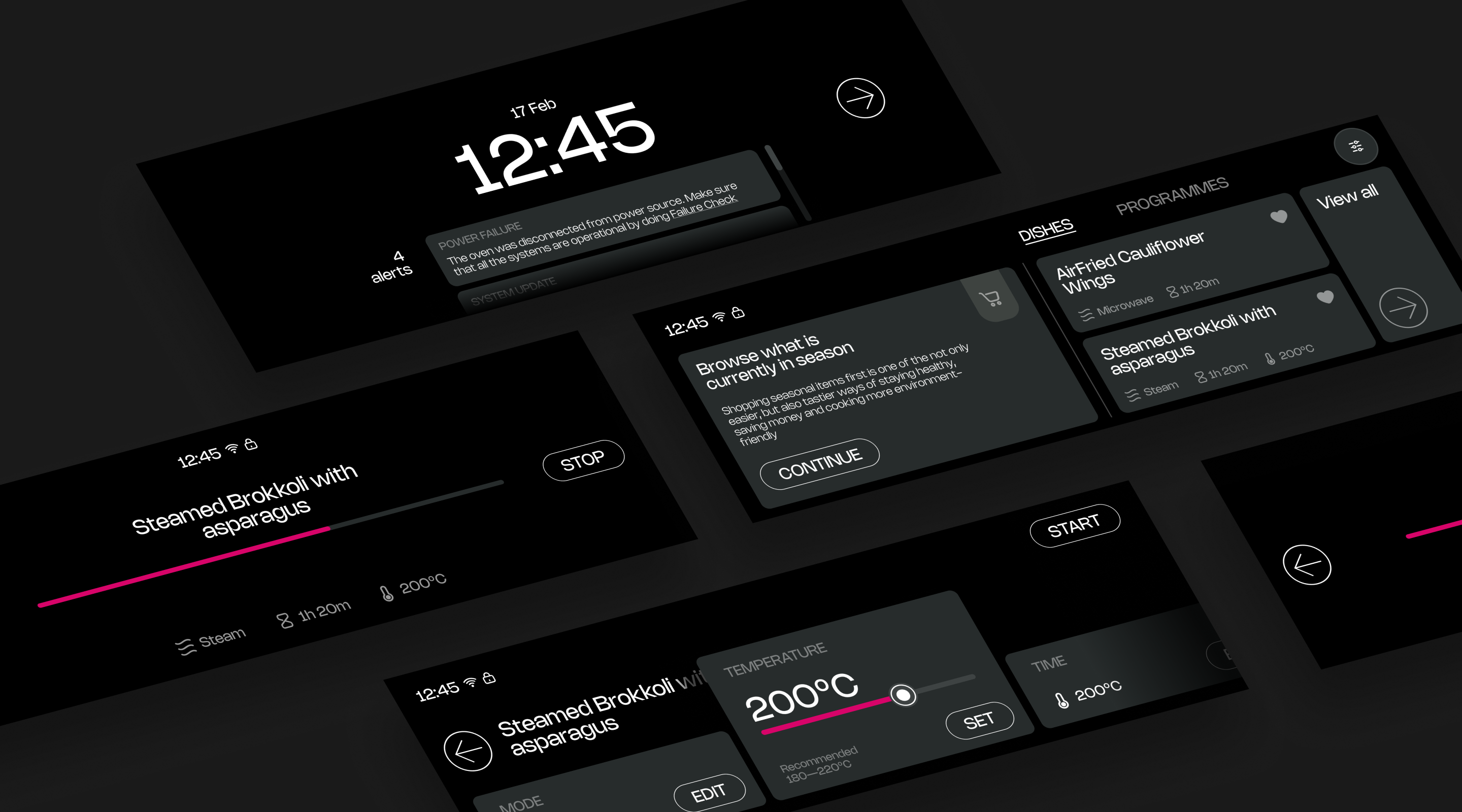
Early explorations for the UI, not part of final delivery
One interface, two very different screens
The oven lines shipped with two displays: a 4-inch screen and an 8-inch screen. Both were about the same physical height, but not the same height in pixels: the 4-inch screen had about 30% lower pixel density, while the 8-inch screen looked sharp and crisp. The brief was to make them look and behave the same. It quickly became clear that consistency could not be solved at the UI level alone, so my work moved into the UX flows as well.
The first plan was to design for 4 inches and stretch it to 8. Instead of arguing, we tested it: we built the stretched 8-inch version and put it in front of users. It did not work, and the result changed the plan. From then on, the two screens were designed as separate interfaces with a shared language, and the next test rounds went well.
Designed for the weaker screen
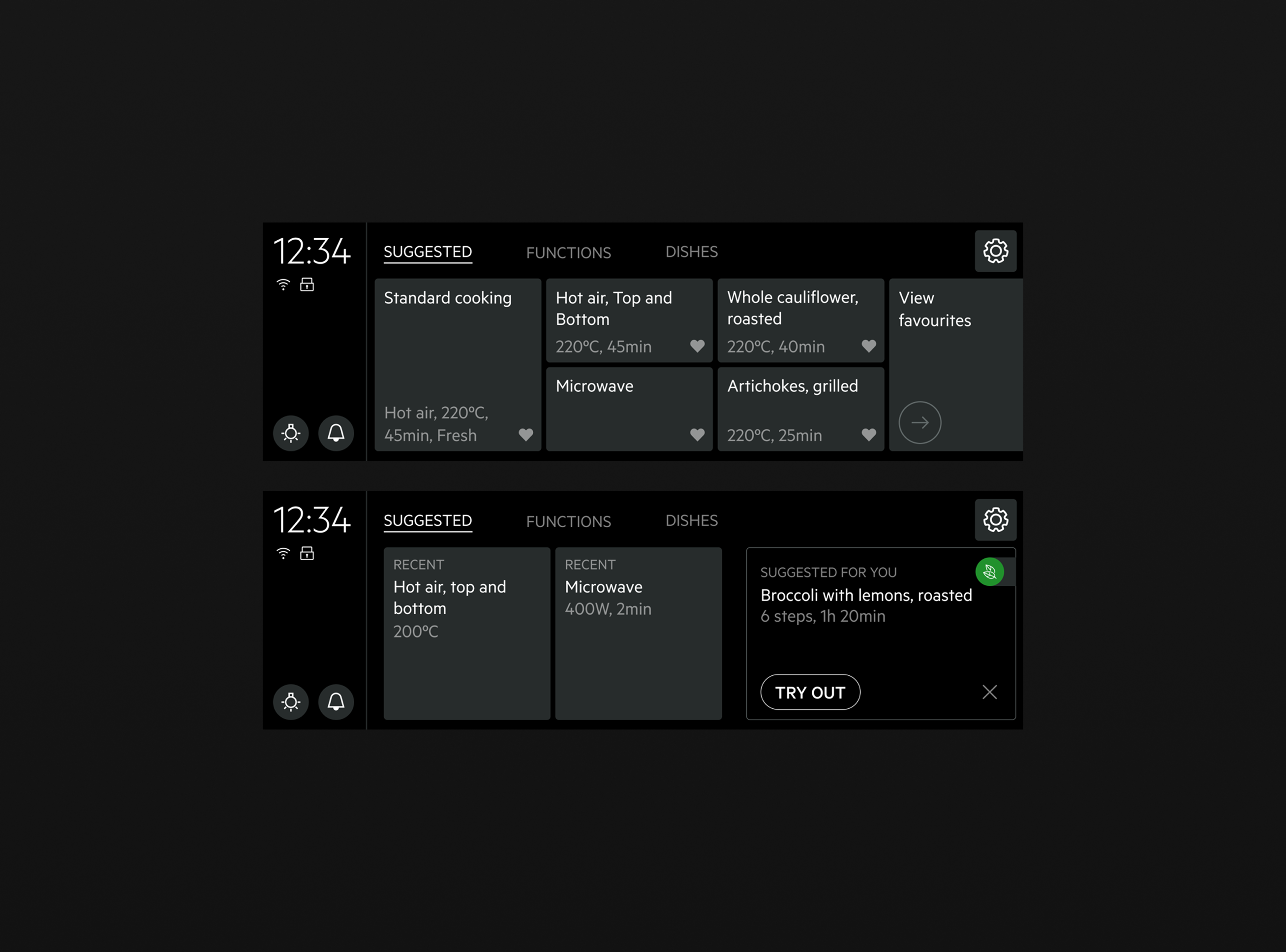
The ovens have no knobs: everything happens on the touchscreen. On the lower-density screen, every curve and soft edge showed its pixels. So the visual language avoided what did not render well: colours that did not render well, shadows and other effects, and rounded corners. A few rounded corners stayed, but shapes were kept as rectangular as possible, so the interface never fought the pixel grid. There was no animation either: the screens could not run it well.
The same rules served accessibility. The tests included older and less technical users, so contrast stayed high and tap targets stayed clear.
From 9 taps to 4
In the original concept, starting a program took at least 5 taps and 2 scrolls. Setting the temperature and the time as well took about 9 taps and 4 scrolls. We proposed recent programs on the home screen and used testing to show that people chose them. With recents, the same start takes 4 taps, no scrolling, and the last settings are kept.


Tools that fit a large team
When I joined, the team worked in Adobe XD. Its support for teamwork was weak: when one person opened a file in a newer version, the file stopped working for everyone else until they updated too. With updates almost every week, the team spent real time agreeing who could update and when. The tool itself matters less than the workflow it allows, and here it was slowing the whole team down.
I proposed moving to Figma and led the change. I rebuilt all the screens in Figma, presented them to the team and helped everyone migrate. As far as I know, we were the first team to move to Figma officially, and everyone was happy with the switch. It also made the next step possible: automating the screens with a plugin.
A plugin instead of a month of copy-paste
Development worked from a spreadsheet that described every screen and every interaction: what each button does, what sound it plays, where it leads. So every state had to exist as a real screen in Zeplin, the handoff tool. With 12 cooking modes, each with about 10 linked screens, the team was spending its days pasting text into frames.
I built a Figma plugin, Needle JSON, that filled the screens from each mode's JSON configuration. The full set produced more than 100 export-ready screens with no dead ends, and saved about a month of manual work. All five designers on the team worked with it, though most of the time I simply ran it and filled their screens in one click. I also shared it with the other appliance teams.

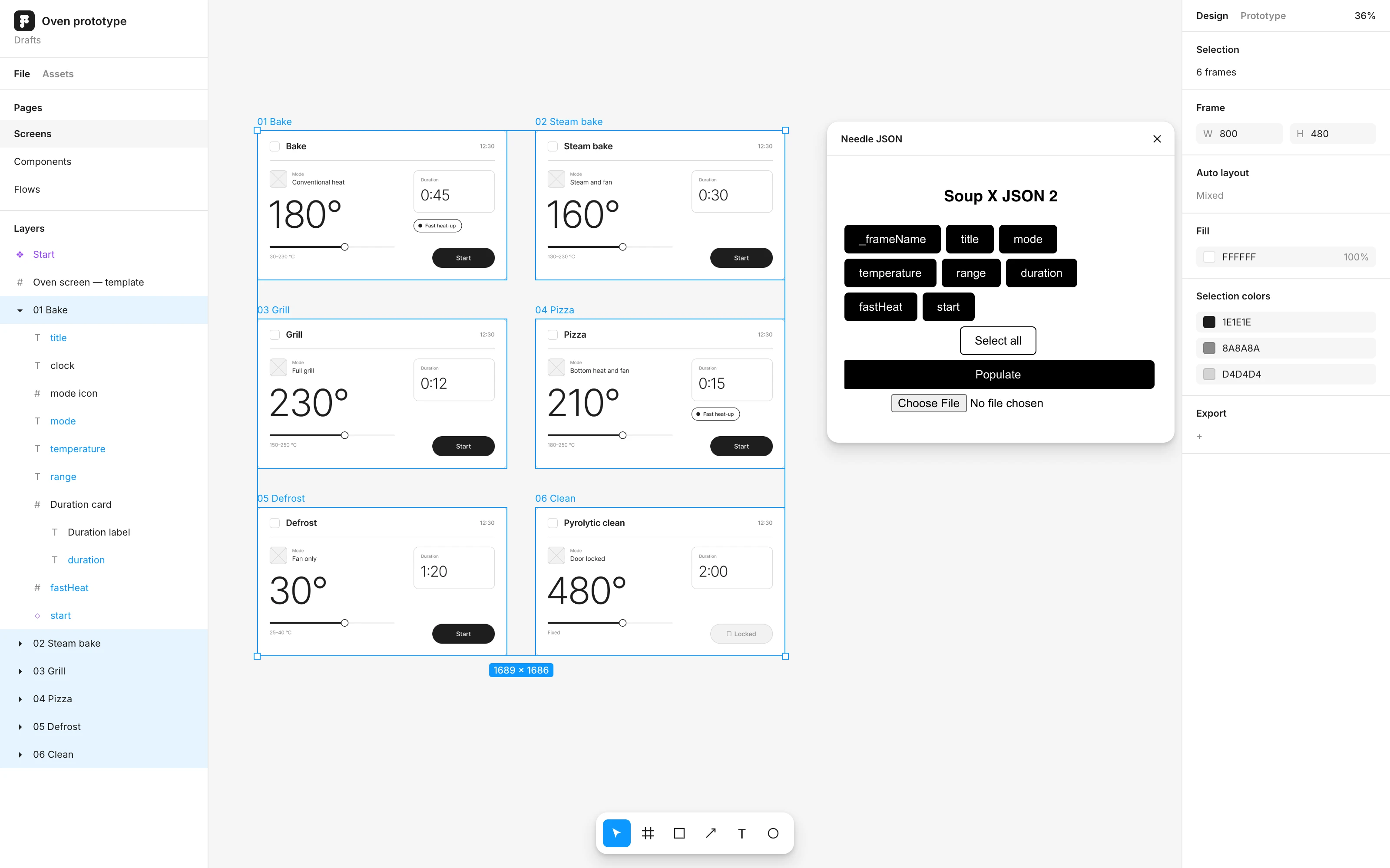
The plugin at work, recreated with wireframes. The real Electrolux screens are not shown.
Result
Over the project we ran more than ten rounds of lean tests with users. An external company ran them in a UX lab with a one-way mirror and a live stream, and their interviewer asked the questions our design team chose. I worked on the research questions and the overall test strategy together with the other designers. Some rounds were strategic, like the stretched 8-inch test. Most checked a single question: do people understand the recipe programs, the recents, the way to set a value?
Working inside a large company, with many teams, brands and approvals, was a challenge of its own. The final design is a clear step up from the previous generation. The interface received an iF Design Award 2025 in Product Interface and User Interface, and a Red Dot Design Award in Kitchen Appliances.