
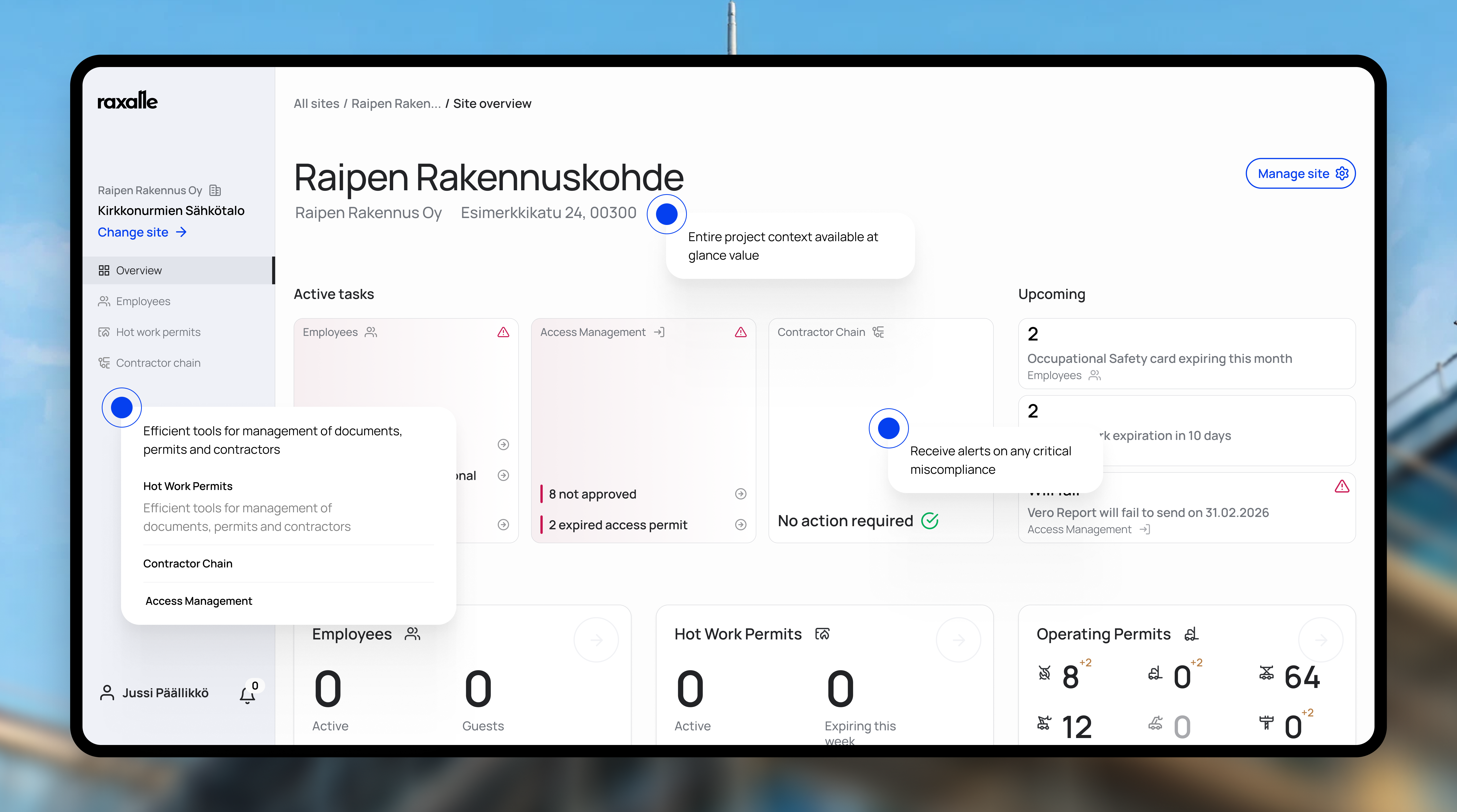
Platform redesign and brand refresh for construction management software
Context
Construction sites run on process: inductions, permits, employee records, compliance documentation. Most software in this space reflects that complexity back at the manager — dense interfaces, features stacked on features. Raxalle's approach is the opposite: digitalize the paper trail, automate the routine, stay out of the way.
The platform has two sides. Induction is where workers arriving on a site read the safety materials and submit their details and documents. The dashboard is where managers handle employees, contractors and permits. Both existed when I joined in 2024. The information architecture made sense, but the product looked dated and had UX problems to fix. I started with a visual redesign and stayed to design almost every feature since: some from an existing starting point, some, like access management, from zero.
Two users, two design systems
The people on each side are very different. Many workers in induction barely use technology; some do not own a smartphone. Managers on the dashboard are not power users either, but they need density: tables, actions, more information per screen.
So I built and maintain two design systems, one for each side, and migrated induction and then the dashboard to them. One system would have forced a compromise that suits neither group.

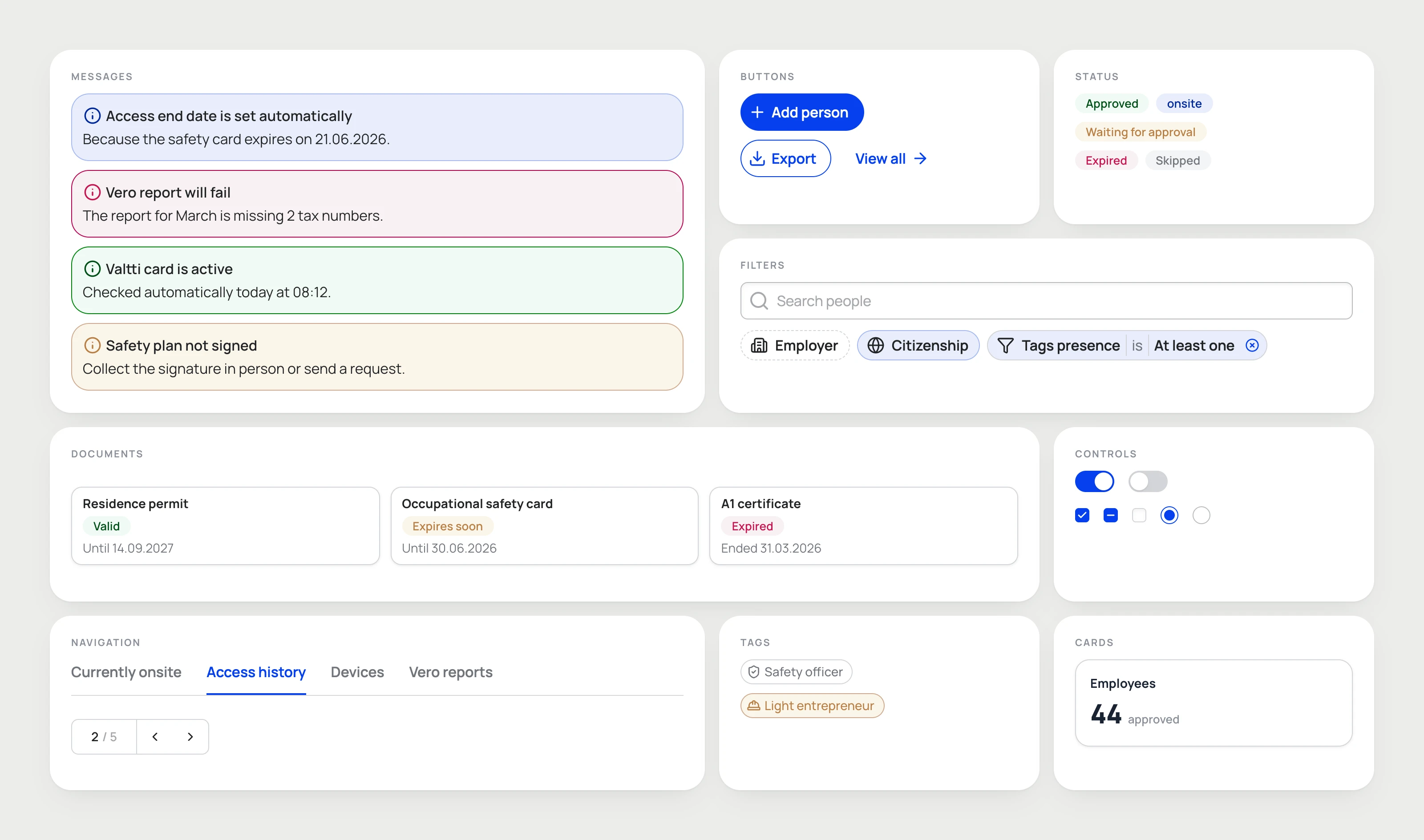
Part of the dashboard design system, rendered from the components in the design prototype.
Induction: easy, but not too easy
Workers want to finish induction as fast as possible. They scroll past the materials, click through everything and submit incomplete information. On a construction site, that is a safety risk. So the goal was never just to make induction easy. It had to be easy to complete properly, and hard to skip.
When I joined, uploaded documents had no type. I proposed labelling them, so the system now knows whether a worker sent a right-to-work document — a residence permit, an EU ID, an A1 certificate for posted workers — or a qualification, such as a hot work licence or an occupational safety card.
The form then splits the work in two steps. First, a short checklist: which of these do you have? Only on the next screen does the worker upload each document and enter its validity dates. Showing every upload field at once looked so heavy that people picked as few items as they could. A light first step gets an honest answer; the heavy part comes after the commitment is made.
For the materials, I designed a reading pace. Text appears word by word, like an answer from ChatGPT or Claude, and the worker cannot go on until it has all appeared. The movement sits on the words they must read, so it keeps pulling attention back to them.
The Safety Guy, designed from data
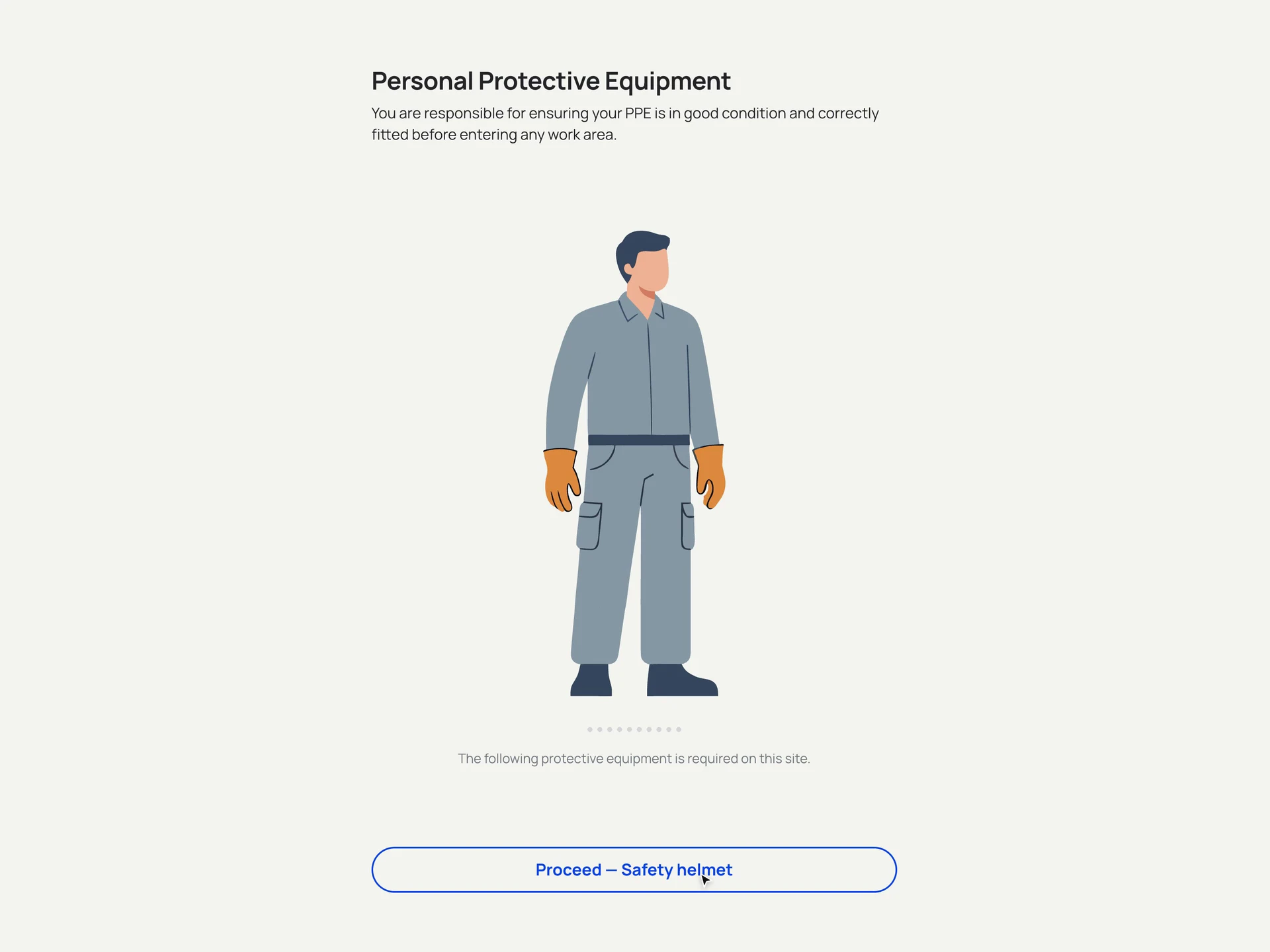
Every induction includes the Safety Guy: an illustration of the protective equipment workers must bring to that site. To redesign it, I first wrote a small Python dashboard that queried real induction materials from many companies and sites, and collected every type of equipment they asked for.
From that list I derived a limited set of variations that covers almost every case, and designed a new, modular Safety Guy where each item can be switched on or off. It looks better and is more fun to use, and no one has come back with a missing item, because the set came from the data, not from memory. Workers step through the items one by one, and the illustration zooms in on each piece of equipment.


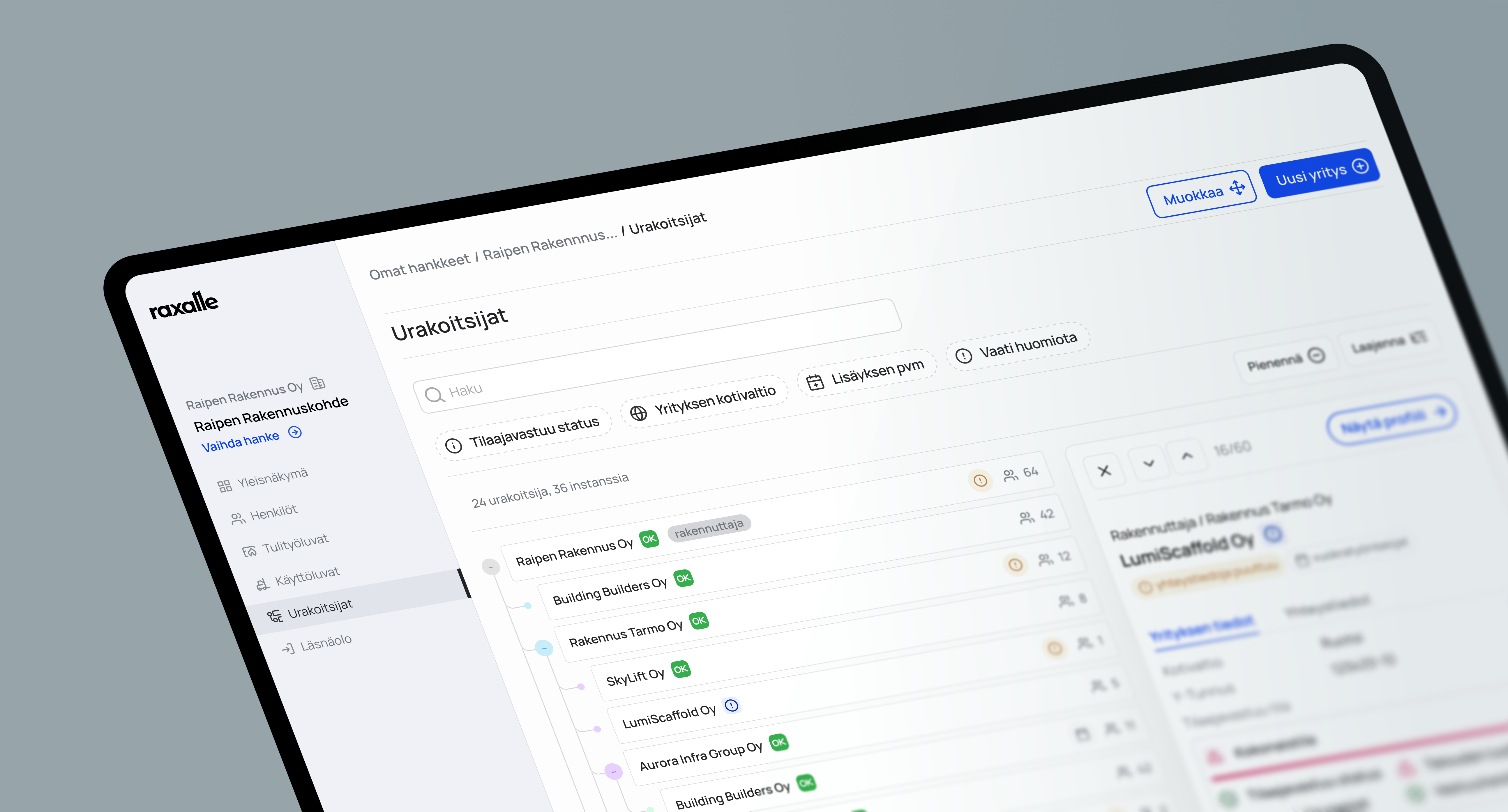
Dashboard: a paper trail you can read
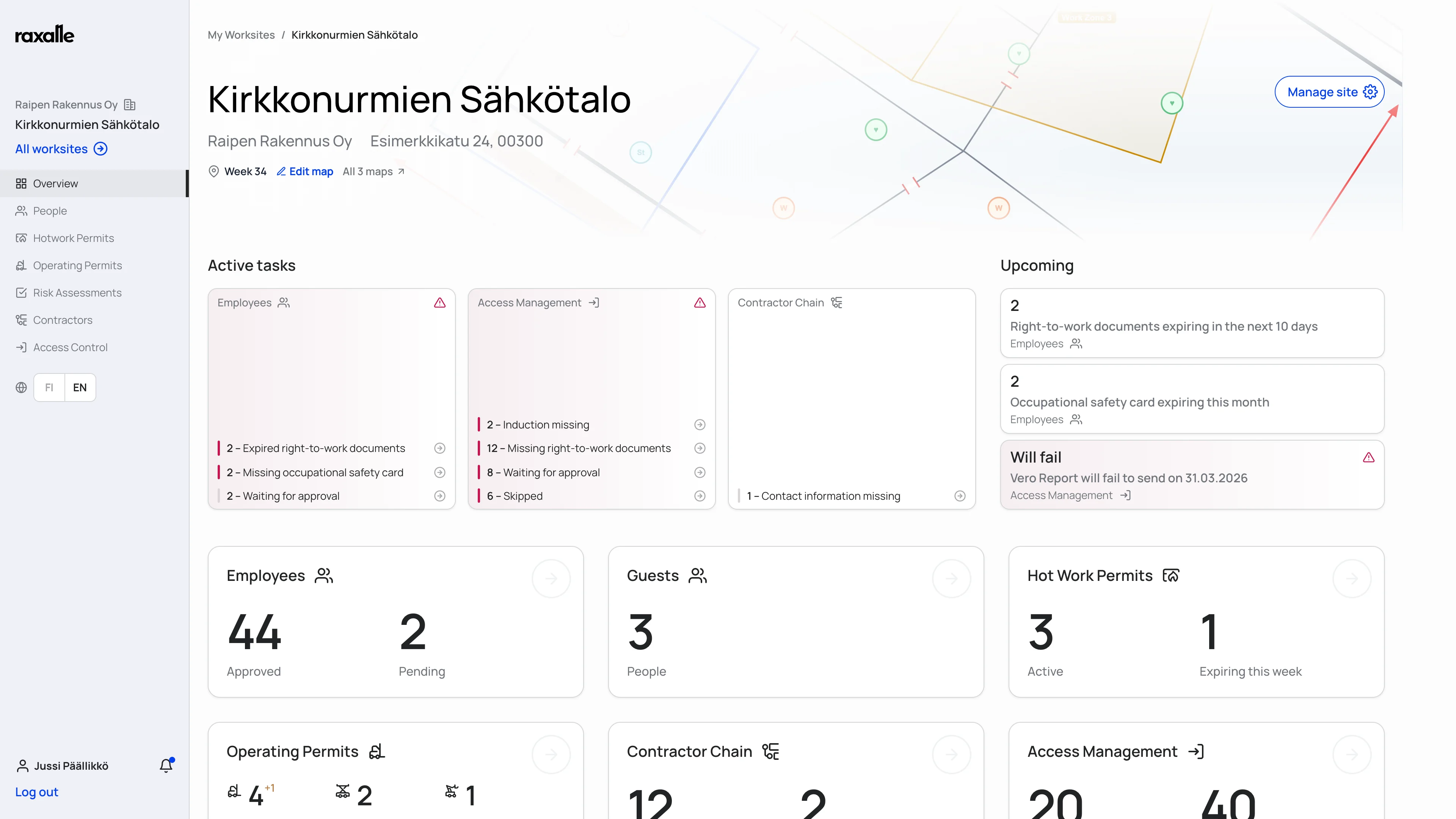
The old top-level page showed very little. I replaced it with a site overview: a hub that gives a summary of everything on the site and a way into each part of it.
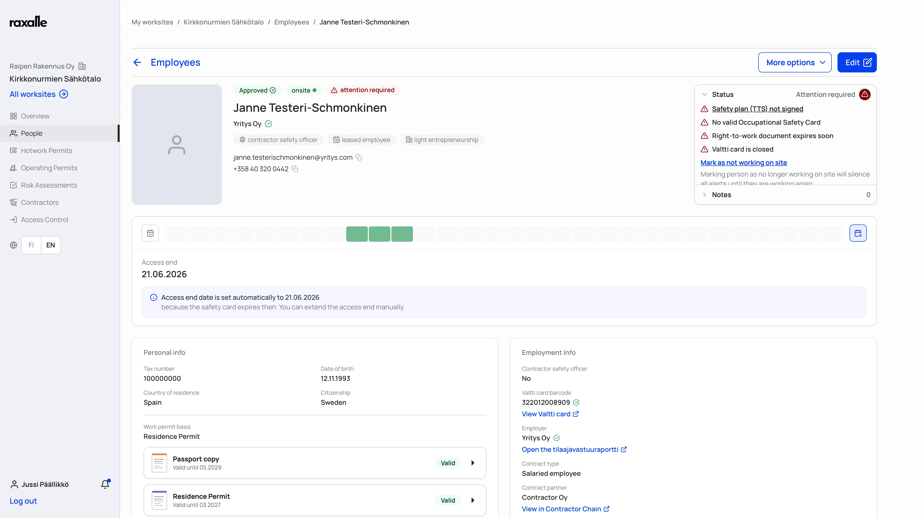
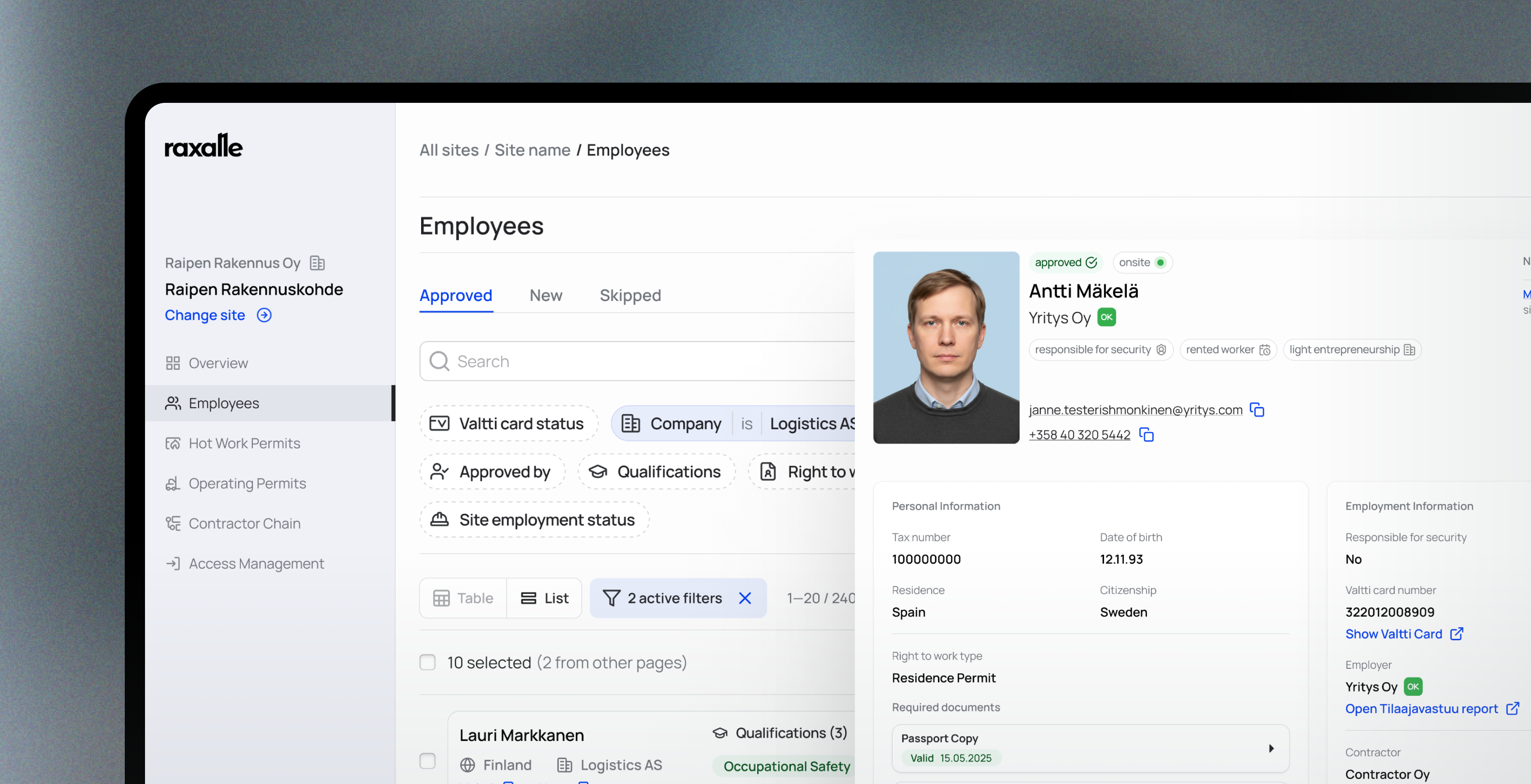
I fully redesigned the employee profile so it reads at a glance. With typed documents in place, we added a document lifecycle: every document keeps its history, from upload to expiry and replacement, along with who changed what. For construction companies the paper trail has legal weight, so managers must always be able to see what happened. An archive keeps expired documents and the records people want to keep for reference, so nothing ever leaves the product.


Access management: one timeline, two places
Access management answers a simple question with a lot of data behind it: who was on site, on which days, and for how long. It took the longest of all features to design. Early versions were tables and history lists. You could pick two weeks and see twenty names, but not how often each person had been there without opening each profile.
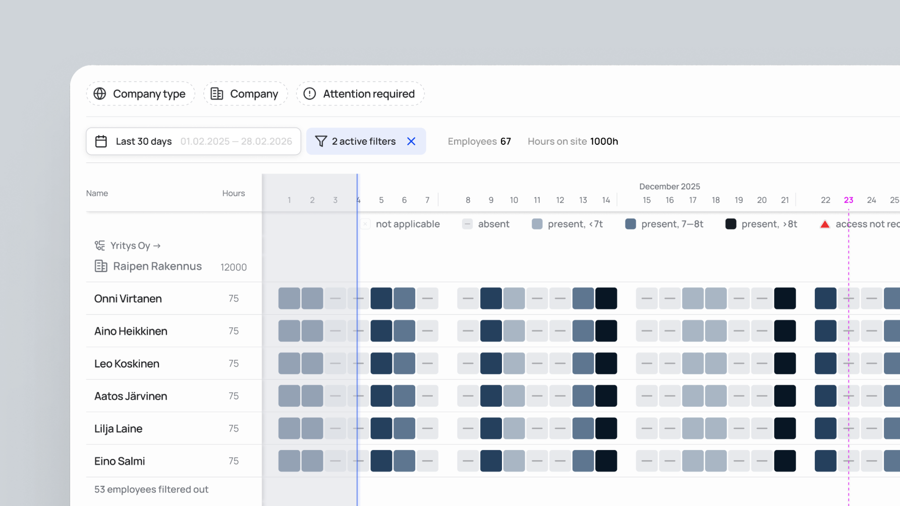
The final design shows one row per person, with one square per day, like a GitHub contribution graph. Behind each row is the person's access period, which the system already tracks for every employee: it starts on their first day on site and ends at the first event that would stop them working, such as an expiring document or the site closing.
That timeline already lived in the employee profile. Using the same component in access management means people learn it once and recognise it in both places. The page also calculates hours on site per employee, per contractor and per company. It has become a core part of what Raxalle sells.

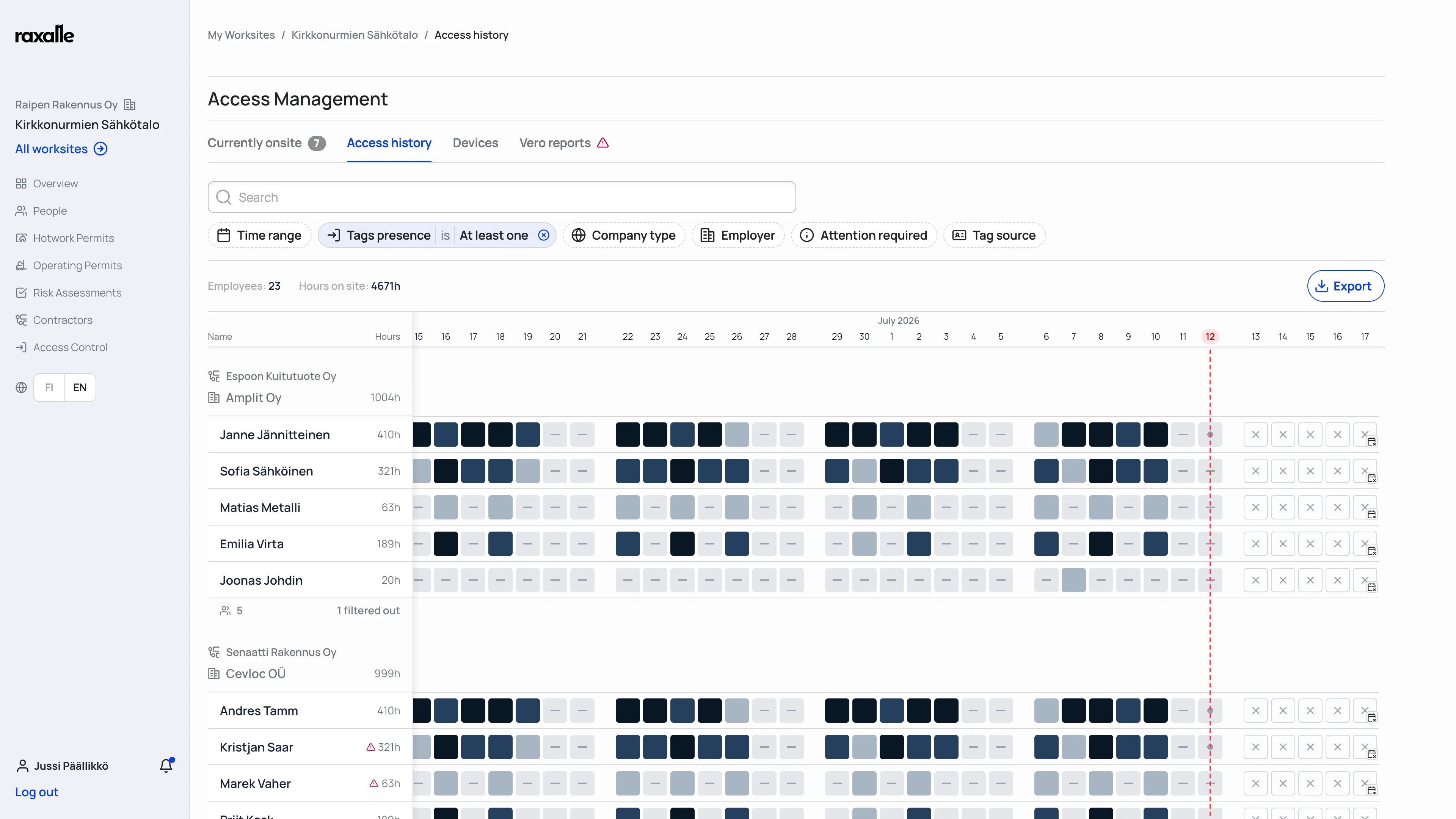
Access history: one row per person, one square per day.



Result
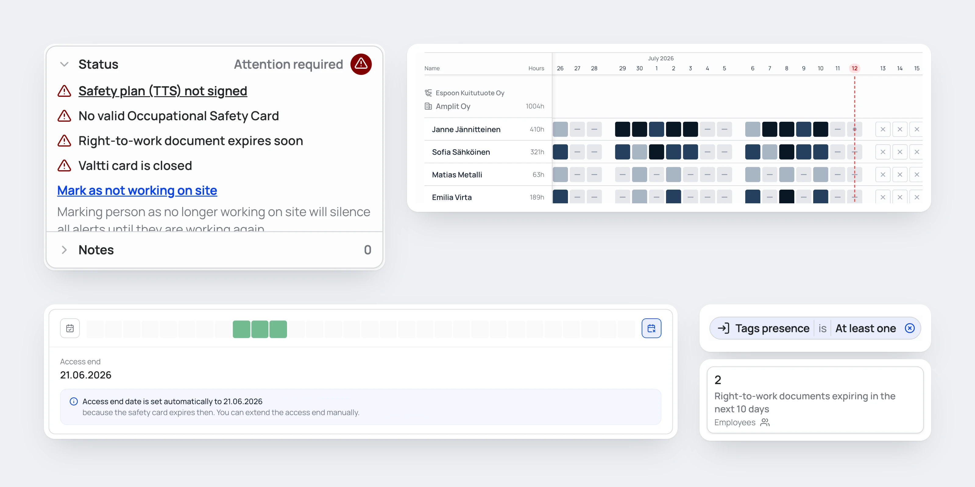
Features are designed to support each other: assigning a permit to an employee automatically verifies their documents before it goes through. Pages avoid table-heavy layouts in favour of bespoke screens that aid recognition and reduce cognitive load. As new designs rolled out, feedback focused on behaviour rather than individual features — that the system feels intelligent and anticipates the next step.
less time spent per employee on administrative processes, per client testimonials from companies with over €100M in annual revenue