Setting Raxalle's visual direction, from brand to landing page
About
I redesigned Raxalle's logo and set its brand colours, then carried them into the product and the website. The landing page is where that direction meets the public, designed and built end to end: interactions, animations, both languages and the visual assets.
The first version ran on Webflow, the second in code; it brought in about 1,000 clicks from Google search. This page shows the third version. Its product videos are recorded automatically by Studio, the video module of our design prototype.
Version 3: the product sells itself
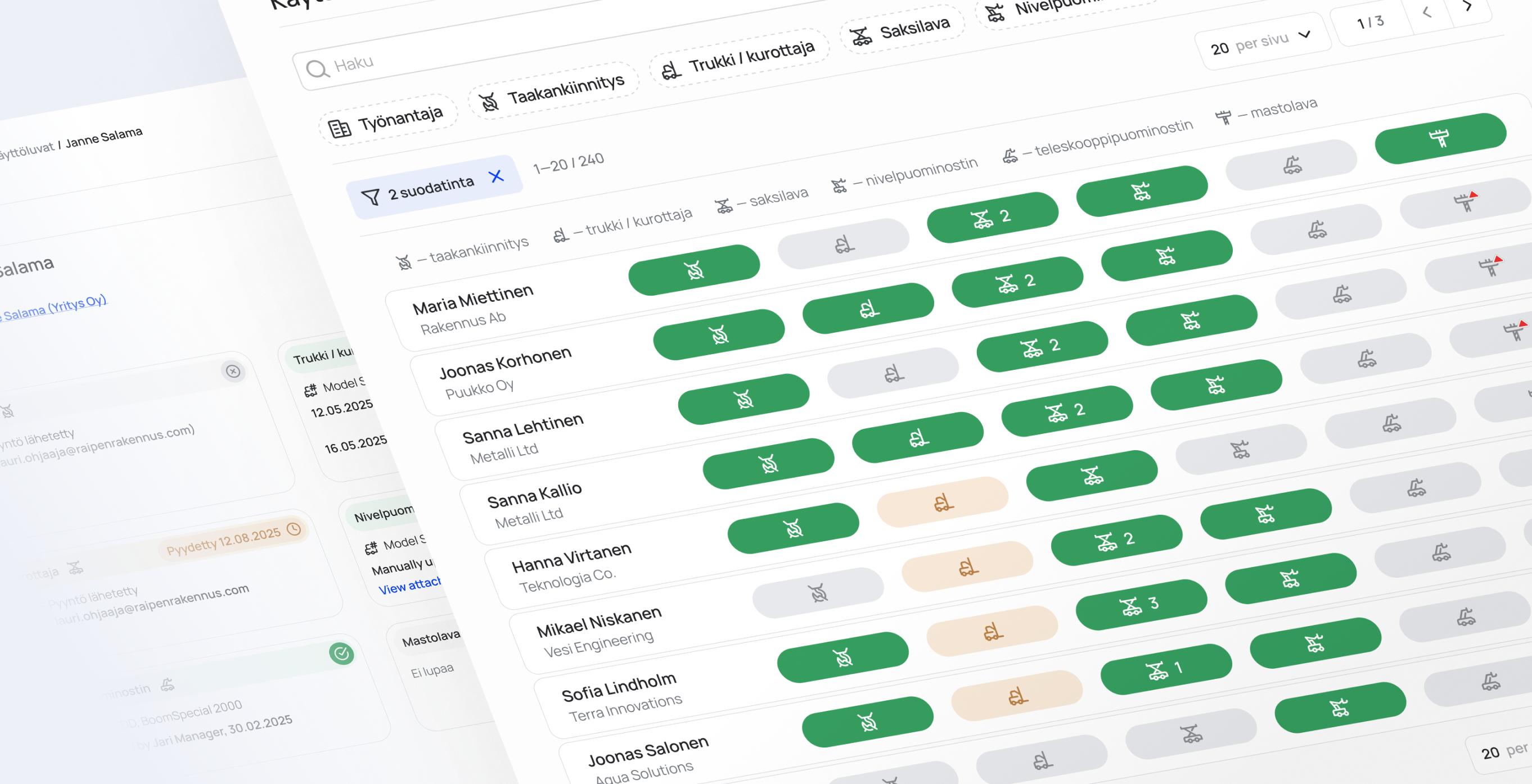
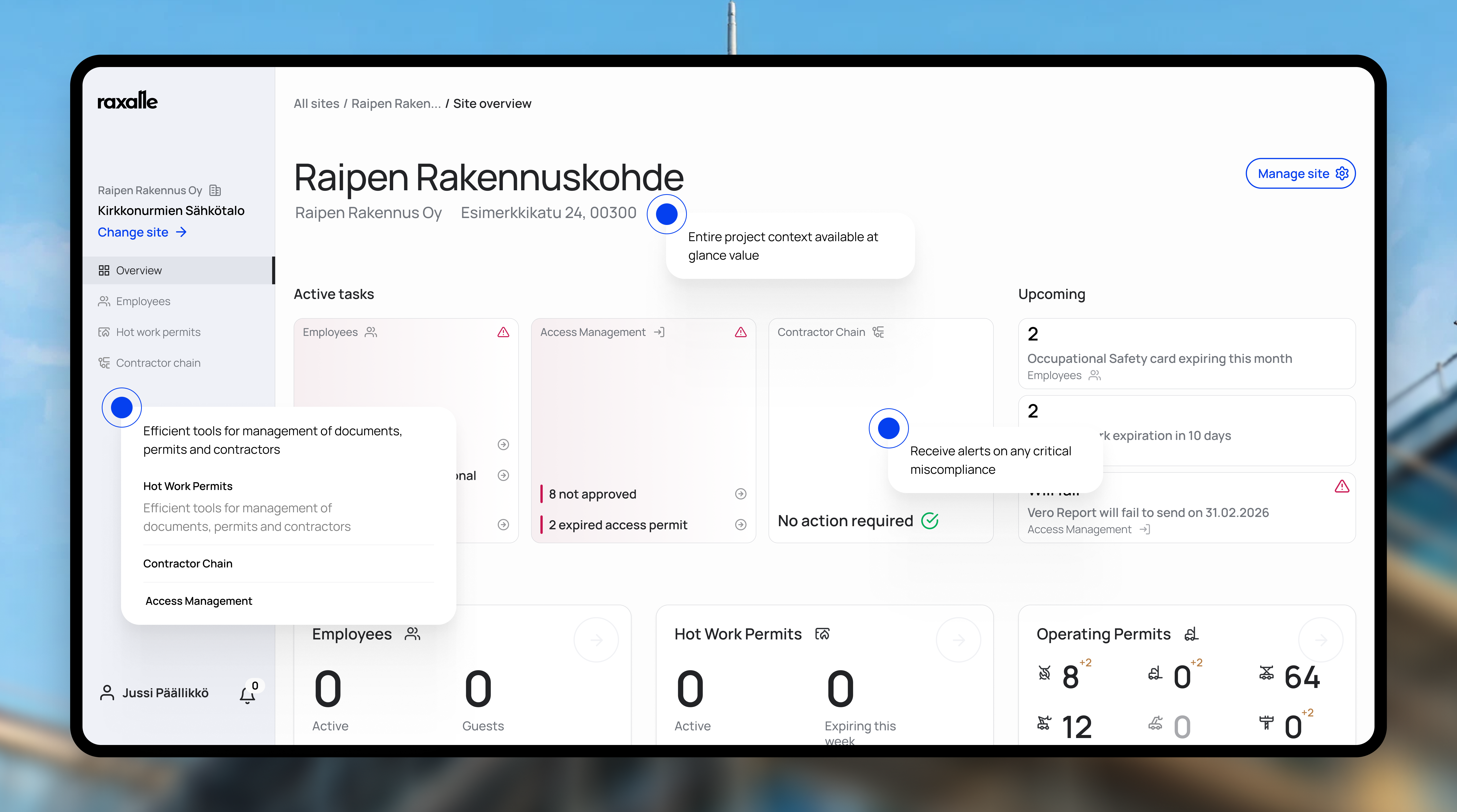
The new version shows the real product instead of describing it. Each feature card plays a short video of the interface, recorded by Studio from the same prototype I design in, so the videos stay current when the product changes. The motion follows one calm style: a real interface, one cursor, precise transitions and almost no added text.
Earlier version
The previous version, built in code with all interactions, animations and both languages.


3D: a direction we explored
Many competitors present themselves through paperwork and compliance. We wanted Raxalle to feel professional and closer to technology and innovation. One direction was a 3D model of a construction site, built in Spline. The direction held, but the model loaded too slowly for production. Version 3 carries the same idea with the real product instead.